Digital fundraising websites need to compel their visitors to action. Your fundraising efforts should incorporate design and marketing techniques for the maximum effect. One such tool, color theory, has the potential to improve your nonprofit’s success and, as is always the goal with nonprofit ventures, create a greater social impact.
Color theory is the study of how different colors, as well as mixtures of colors, impact an individual. A great deal of marketing and scientific research has gone into improving our understanding of which colors speak to our donors, and which colors do not.
Using the correct combinations of colors on your website, you can create an emotion that contributes to your overall message, as well as appeal to the naturally aesthetic sense of the audience. On the other hand, an odd or misplaced mixture of colors has the potential to distract or discourage users from staying on the page and supporting your cause.
Colors on the Color Wheel
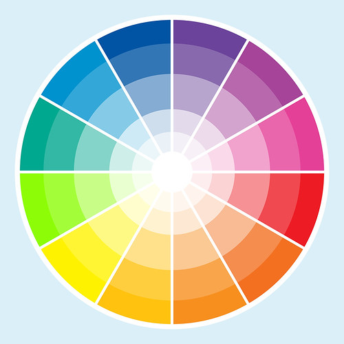
First, it is important to understand the relationships between basic colors. These are often broken down into the color wheel. While it may seem like a grade school task, this is an important part of marketing and graphic design.

The primary colors, determined by their place in the visual spectrum, include red, blue and yellow. These form the three corners of a triangle on a color wheel. Between these lie the secondary colors; violet between red and blue, orange between red and yellow and green between yellow and blue. Finally, the tertiary colors, like red-orange and blue green, consist of a mix between a primary color and secondary color.
Using this structure, every possible color can be filled in between these basic points. You can then use these points to determine complimentary colors, or colors that work well together and are aesthetically pleasing. These colors may lie adjacent to one another on the color wheel, or can even be far apart from one another on the wheel. For the non-experts, there is a wide range of tools to determine which colors will work well together. Many, however, first choose a base color by decided between a warm and cool color scheme.
Warm Colors vs. Cool Colors
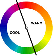
One of the most basic rules of color theory involves the difference between warm and cool colors. Warm colors include reds and the more earthy and natural tints, such as tan and brown. Cool colors, however, fall in the real of green and blue. Many people also include desaturated colors that fall close to grey. Depending on the type of organization, you will want to choose between the two schemes.

Warm Colors
- Encourage passion
- Speak to our primal natures
- Are reminiscent of love, kindness and joy
Cool Colors
- Have a calming effect
- Connect with reason and logical pursuits
- Remind the audience of rain and the oceans
Choosing the correct message to send to your audience may determine their ultimate decision to contribute to your fundraising campaign or move on.
Expanding on the Theory
The distinction between warm and cool colors, as well as the idea of complimentary colors, is but the tip of the large study on color theory. Many people study these ideas for years as part of their design or marketing education. You can, however, make use of these theories without undergoing such a rigorous process.
Take advantage of a color selection tool, like Colour Lovers. This online platform allows you to find complimentary colors, as well as see the pallets created by other artists. You are even able to sort by popularity to find the perfect scheme for your nonprofit fundraising website.
Apply these ideas to your website’s color scheme, as well as your other marketing publications. You will find that you communicate better with your donors and, as a result, receive a better response. Moreover, improving the aesthetic appeal of your online fundraising website furthers the credibility that your nonprofit organization receives.


