Now that Twitter’s new header feature has been live for a while, we figured we’d have a look and see what nonprofits were coming up with to make the most of it.
The usual leaders have done a nice job with their images, and a few lesser-known groups have also put up some cool stuff. Below are a few we thought were worth a look for any nonprofit getting ready to design their own:
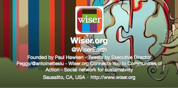
“The social network for sustainability” not only connects people, but also is putting the world back together. We see what you did there, and we like it!
Even if you can’t read, you can see that UNICEF is all about the kids.
Festive and totally mission-appropriate.
DWB/MSF is great at showing true images that visualize the problem and the solutions delivered without “going too far.”
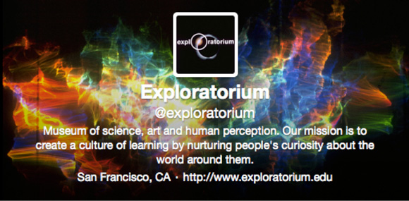
Essentially, this header says, “Attention Twitterverse: our exhibits are awesome. No drugs are needed to trip out here.”
Water.org used a very human, expressive photo, which can work well for a lot of causes. Who wouldn’t want to give this young lady a hand?
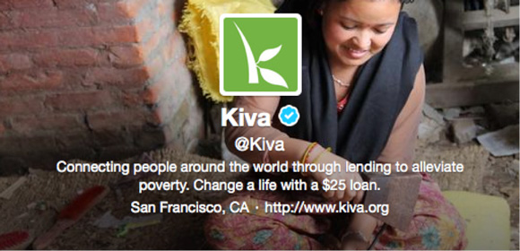
If Kiva’s mission sounds too abstract, the header image makes things more concrete.
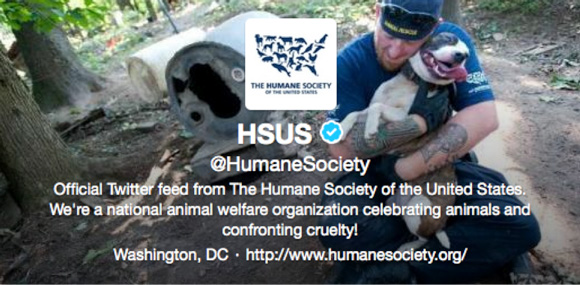
The Internet is the largest happy pup photo gallery ever created, and The Humane Society has captured one of the finest ones. (The human sharing the love is just a bonus.)
—
If you’re looking for tips on how to make the most of your new header image, check out Fast Company’s Twitter Header guide. For a more on how to actually go about uploading and configuring your new header, read this basic tutorial.
