A couple of weeks back, we had the opportunity to go check out our second 501 Tech NYC event this year. This organization’s May event was a helpful presentation on changes you can make to your nonprofit website that leads to more traffic and better engagement. Presented by the founding partners of RAD Campaign, 10 Ways to Make Your Website Smokin’ Hot This Summer was a great opportunity to learn about quick methods to improve your digital presence.
So what did we learn?
1. Simplify!
A car buff would immediately compare a nonprofit website to a fine-tuned automobile. And we have to agree, so we should take Lotus founder Colin Chapman’s approach to building cars and apply it to your website. His philosophy? Simplify then add lightness. You should remove all unnecessary information from your home page and focus solely on getting your organization’s message across with as little clutter around it as possible. And just like the car, can you do this and make your site attractive? This can lead to more donations.
2. Keep Dinner Intimate
Dinner with friends and family should be intimate, the relationships and decision making for your web design should be even more intimate. Only have a small team (2-3 members) that has the ability to make decisions regarding your website’s design strategy. Inviting everyone in your organization to input their opinions on design will lead to inefficiencies and dissent.

3. Know Who Knows You
Your audience should always be the main focus of web design. By knowing what they want, search for, need help with, you can design your homepage accordingly to keep all that information within reach. The key to a great user experience (UX) is reducing the overall amount of work and effort it takes for a user to take action.
4. See Through Their Eyes
Eye patterns have been a relatively new focus in marketing, but a ton of studies have shown that there are certain areas on a web page that get more attention than others. By knowing what your audience focuses on visually, you can cater your content to align with their reading patterns.
Studies have shown that the majority of users read in an F-shaped pattern. To see how your audience views your most relevant information, you can use a service like CrazyEgg, which provides heat maps and visualizations of traffic patterns on your website.
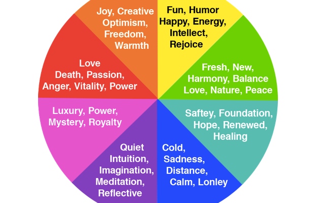
5. Colors Matter
By knowing the psychology behind colors, you can design your website using hues that evoke certain emotions. For instance, green evokes emotions of healing, success, or hope and yellow evokes happiness, optimism, and youth. So if you’re organization deals with medical issues with children, you can use those two colors to spread your message.
6. Sliders Are Dead!
With only an infinitesimal percentage of users clicking on sliders and carousels (1%), having them on your homepage makes no sense. Instead of spending money and time designing “cool” sliders, focus your efforts on creating an engaging hero image with strong calls-to-action.
7. A Picture is Worth a Thousand Words
And guess what? So are videos, infographics, and other visual cues. Instead of using words to get your audience to take action, use imagery and data visualizations to tell a story. Use words in the form of strong calls to action following your visual stories.
8. Design Your Site to Fit Every Medium
Responsive design is the latest trend in web design and there’s a reason for it. Mobile devices made up 55% of web traffic in January. More than 55% of American adults have smartphones and 42% have tablets. If your website doesn’t look great on a smartphone or an iPad, you’re losing valuable traffic, so making your site responsive will ensure that every single user is being catered to.

9. Then Reverse It!
Just as the responsive design takes your website and makes it an enjoyable experience on a phone or tablet, you should think about taking the visually-oriented mobile design and bring it to your users’ desktops. Trends in web design show that single-scroll, hamburger menu buttons, and large vivid images, are more engaging than traditional content-heavy sites.
10. Content Is Still King!
By focusing on great content, you’ll ensure that people are coming to your website because they’re actually interested in what you have to say. Making that content available within a click’s reach is just as important as catering it to your audience. Having widgets that curate content relative to what your users are reading is another way of keeping people on your website.
11. Headlines Matter More Than You Think!
Writing great headlines automatically leads to better click rates. Take Upworthy’s approach to headline writing. Come up with more than 10 for every piece of content you create, this way you can test different ones to see which one gains the most traction. Using numbers, asking questions, and creating a sense of urgency are all different methods of creating stronger headlines.
12. Big Data, Small Data, All Data!
Content can only be king if you show data and lots of it. Providing data through visual cues such as infographics can be a highly engaging way for your audience to consume your message and even more importantly, share your message with others. Using numbers creates tangibility, which is key for people to take action.
13. Test, Test, Test!
All the changes you make to your website won’t matter if you can’t see the results. By A/B testing every change you make, you can see if all of your hard work is paying off, or if you have to go back to the drawing board.
While some of these insights can take weeks or months, most of them can be implemented in a short period of time. The weather is just heating up so there’s no reason to leave your website in the cold.
Show us what changes you plan on making this summer but in the meantime, check out the full slideshow below!


