Chances are your organization has some kind of donation form on your website. It’s 2024 after all: we know that donors want the ability to give digitally. But it’s also likely that you haven’t created a donation page that converts as well as it could.
That’s a serious problem, because it means that no matter how much work you do to get people to that page, you’re not going to see any return when they decide not to give. If your donation form is overly long, clunky, or confusing, you’ll be dealing with frustrated donors, losing out on revenue, and scaring donors away from coming back to make a second gift.
More than half of donors worldwide prefer to give online with a credit or debit card, so your online donation form is an absolutely essential element of fundraising. But what does it mean for a donation form to be truly outstanding? What are the features of a good donation form?
Let’s take a look at some of the most important features of a high-performing donation form, and explore how you can use CauseVox to make them happen.
Best Practices for High-Performing Donation Forms
There is a lot of research about the best way to put together a donation form, but it all boils down to one basic principle: make it fast and easy. When you have too many form fields or donors can’t find what they’re looking for, they’ll leave the page. If that sounds too vague, there are some really concrete tips you can use to make your donation form really shine.
Including (And Optimizing) Recurring Donations
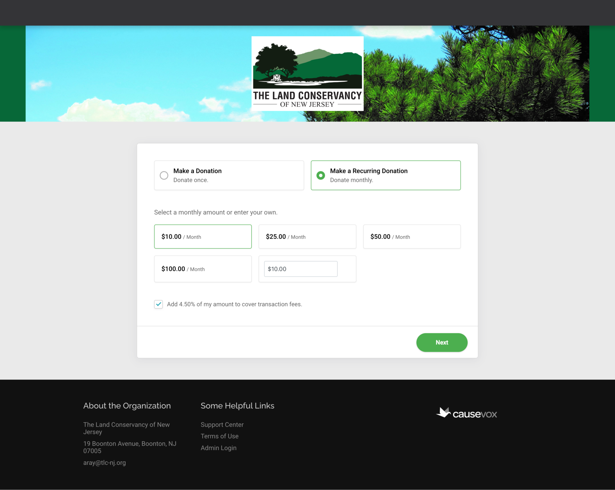
Recurring giving is one of the most beneficial types of giving for nonprofits because it instantly turns someone from a one-time donor into a consistent supporter: the easiest donor retention ever. To make your donation page the best it can be, include an option for recurring giving. Not sure how? CauseVox offers a free guide to help you set up a winning recurring gift campaign. You can make it even more effective by setting “recurring” as the default option. People will be much more likely to choose it if they don’t have to click anything.
Donation Tiers
The IIIC reported a $100 increase in average gift size when they started using the CauseVox Donation Page – a change they attributed in large part to donation tiers. Donation tiers are suggested giving amounts, often with a small piece of information about the impact of the gift level. They’re useful in pushing donors to give more, but you have some decisions to make about donation tiers as you set up your form.
Your first major choice is between compact tiers and descriptive tiers. Compact tiers only list out a donation amount, while descriptive tiers include a short impact statement.
Compact tiers are particularly useful if you want to keep your form as short and sweet as possible. Donors don’t have any extra text on the page to read and they can make their decision quickly. With shorter and simpler donation tiers, you remove friction, and therefore help donors get onto the next step faster. This is a great choice if you have impact statements somewhere else on your page.
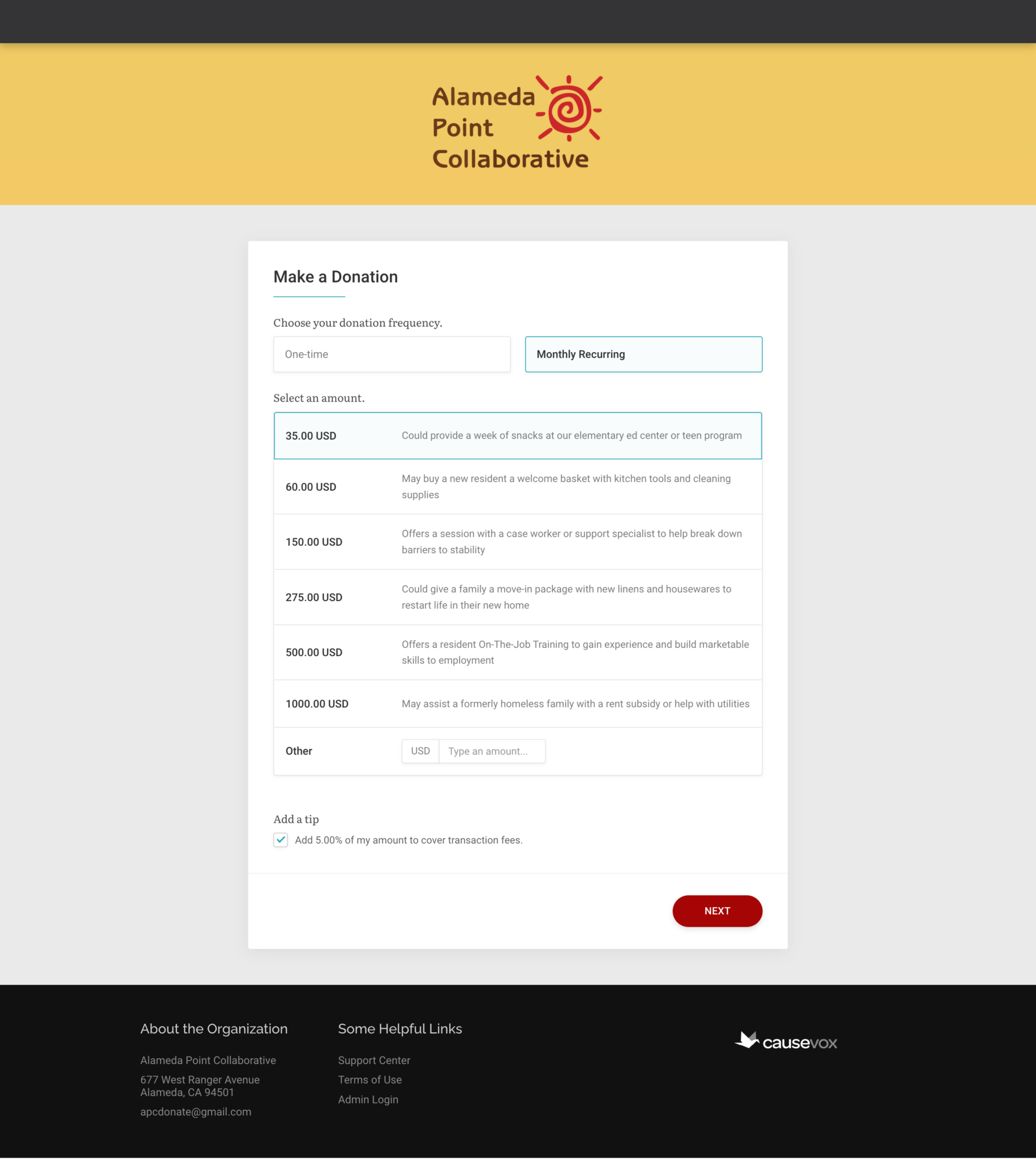
On the other hand, descriptive tiers make donating more compelling for your donors. Instead of having to determine how much of a contribution they think will make an impact, they can select from a list of predetermined tiers that are tied to specific and tangible impacts. 68% of donors agree that knowing how their donation makes an impact is important to their gift.
Once you’ve chosen compact or descriptive, it’s time to select the tiers themselves. Keep your tiers to 3-6 options: any more than that and you’ll overwhelm your donor. The easiest way to start selecting amounts is by looking at your average gift size. That’s a good jumping off point: add in one lower amount and one higher amount, then maybe one additional stretch goal amount for your larger donors.
A good trick to start increasing donations is to pull your average gift size, then increase it slightly: if your average gift is $50, try a donation tier of $55 instead.
Check out our blog post on donation tiers for more information on creating the perfect donation tiers for your page.
Custom Fields
As you create a donation form, you’ll have the option to add in custom fields. Unless you have a very specific reason to ask for additional information, it’s a good idea not to add custom fields. To make your donation form as quick and painless as possible, you want the fewest number of fields you can get away with. That may also include asking for an address: if you have an email you can send your donors digital thank yous rather than paper, making an address unnecessary. Over time, you can ask donors more about themselves to add in information like address, but including it in your donation form will lower the conversion rate on your form.
One particularly useful field that CauseVox has is the subscribe box: this lets your donors subscribe to your email list. Even better, you can leave it checked as a default, which will lead most people to leave it and subscribe to your email list.
Donation Pledges
Often we don’t think of an online donation page as a way to ask for and manage larger donations, but new technology is making it more and more possible to ask for significant gifts from a broader audience. Specifically, pledge forms on CauseVox help you increase your gift size and get more large gift pledges online, while also automatically fulfilling them.
With pledges, any donor can become a major donor for your nonprofit, because donors are able to break out larger gifts into installed payments over a period of time. A donor can pledge $1000 over the course of a year, and pay in increments that work for them.

So how does it work?
- Your donors select their gift amount, whether from donation tiers or as a custom amount
- Donors choose how often they’ll make payments (annually or monthly)
- The first installment is billed immediately, and each following installment is billed automatically.
- Your donors will get an automatic email upon completing each installment with an update towards their total pledge and a secure link to manage their payments.
Add a pledge option to your form so that donors can give more over time.
Building Your Donation Page on CauseVox
Now that you know the best strategies for building a donation page, let’s explore how you can create one on CauseVox. There are tons of features included in donation pages through CauseVox. Once you’ve logged in to CauseVox and started a fresh donation page, you’ll see a variety of options down the left hand side. Make sure you take a look at each one: there are plenty of goodies in there.
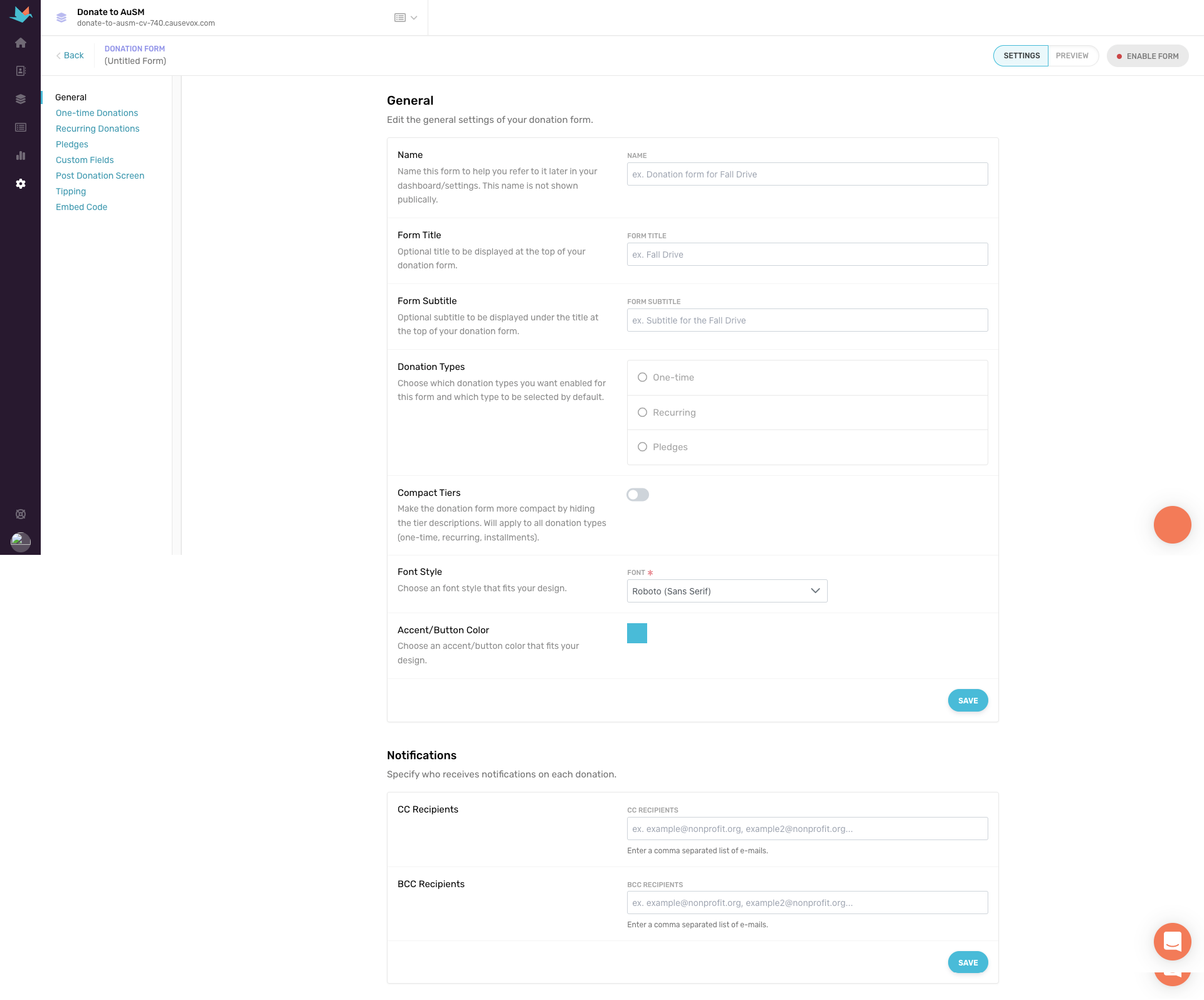
A few highlights to get you started:
- Customizations: there are plenty of places you can customize the options on your donation page. This includes donation tiers (which you can find under one-time donations and recurring donations), the receipt (subject line and content), your form title, and even the color of your donate button. Take the time to update each of these areas: it will help your donors more easily navigate the page and make it look more like your brand. One area to pay close attention to is Pledges. This is where you can set up pledges and you have quite a few customization options including interval of payments, the period of the pledge, and suggested amounts.

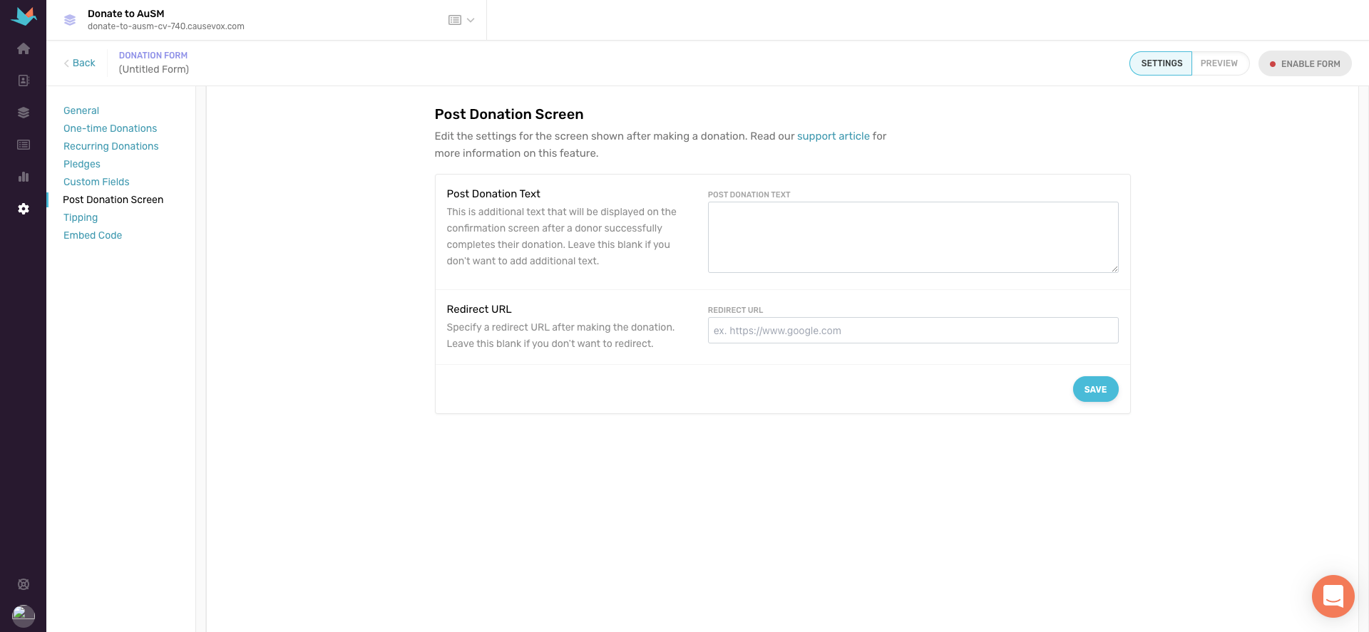
- Post Donation Screen: the Post Donation Screen is what your donors will see once they complete their donation. This is a great place to put a short thank you message or additional ways they can keep up to date with your organization (an email list or your social media handles are strong options). You can also add in a redirect URL: this means that when a donor completes their transaction they’ll be sent to this URL. Immediately after donating, a supporter likely feels positively about your organization. A redirect URL can be a good way to cement that feeling. Maybe you share an upcoming event, a free resource, or another service your organization offers so they can really see the impact of their gift.
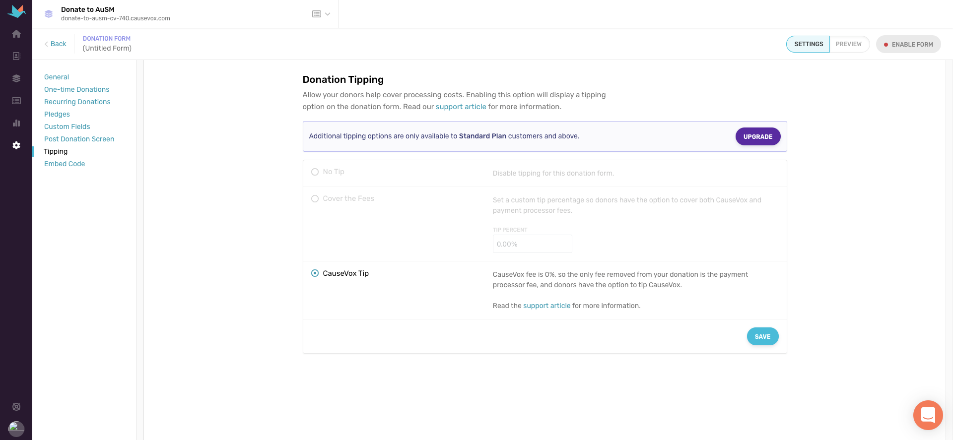
- Donation Tipping: this is one of our favorite features because it allows you to accept donations with a 0% platform fee. To offset costs of running our platform, your donors are simply given the option to tip CauseVox if they’d like. It’s completely optional!
- Embedding your form or donate button: you can always link to a donation page that isn’t directly on your site, but donors generally feel more comfortable when they can complete their transaction right there. It’s pretty easy to do: all the instructions are in the “Embed Code” section of the donation page set up, and we provide all the code for you to copy and paste anywhere on your site.

It’s as easy as that! If you’re ready to upgrade your donation page, sign up for a free demo or get started with building your donation form on CauseVox today!


