We’re used to seeing it all the time- a website and a completely separate fundraising campaign site. And, while it may be the norm, promoting your campaign on your website is key to having an integrated marketing strategy.
Directing people on social media and through email to your campaign is good, but what if a potential donor saw one of those and decided to head to your website for more information on your latest campaign — would they find anything?
Or, for that matter, if someone came through your website, would they even know you had an amazing fundraising campaign going on that they could get involved with?
Make it easy for your audience to find out information about your fundraising campaign by incorporating it into your website. Here are 3 proven methods to help you drive donations to your campaign through your website:
1) Celebrate Your Fundraisers
You don’t have to plaster your website with campaign links to effectively inspire people to look at your campaign. One of the best ways to drive people to action is to show them what other individuals are doing to support you already. This is encouraging for a number of reasons:
- Showcasing people who are fundraising for you acts as a form of social proof- it shows your audience that other people have already signed on and are actively raising funds to support your cause.
- It encourages your audience that if other real people were able to fundraise effectively for you, then they can do it too.
- It shows the people that are fundraising for you already that their efforts matter to them, and therefore helps to drive them to get further involved in your organization.
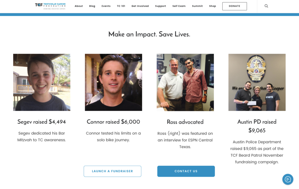
Here’s one example of how this looks on Testicular Cancer Foundation’s homepage:

By highlighting 4 people who have fundraised and advocated for them, Testicular Cancer Foundation ultimately calls their audience to action to join in the fundraising efforts with their “Launch A Fundraiser” button, which is linked directly to their campaign site on CauseVox.
This ultimately works for the benefit of the whole organization as a form of social proof and ends up driving people to get involved in their campaign that possibly wouldn’t have ever thought to fundraise on their behalf.
2) Create A Landing Page
One of the ways to best feature your campaign on your site is to create a landing page specific to your campaign that’s used to convey important information about the campaign to lead people to get involved.
The better this page is built out on on your site, the more it’ll pique the interests of supporters to click and learn more.
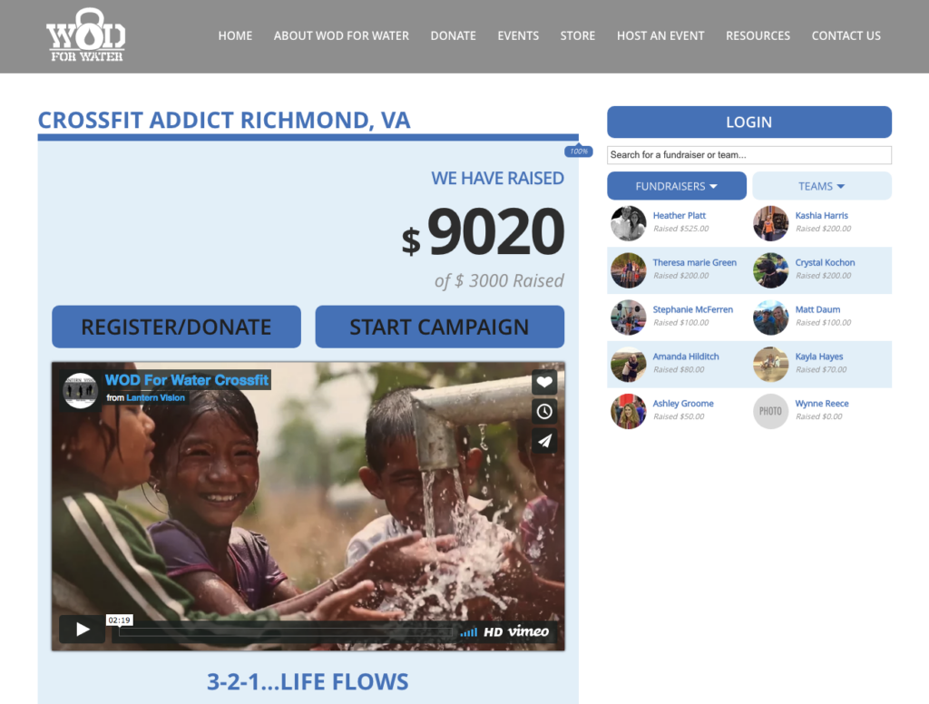
Here’s an example of Neverthirst’s WOD for Water campaign landing page:

Neverthirst is careful to include the title of the campaign, the funds raised, a progress bar, call to action buttons to donate and start their own fundraising page, a login button, a fundraising listing, their campaign video, and even their appeal.
In this way, they’re showing a lot of their campaign on their landing page, but still directing people to the campaign site with call-to-action (CTA) buttons that link directly to the action that they’d want to their audience to take, such as the direct link to the donation form, fundraiser signup form, and fundraiser login screen.
This makes it very clear to your supporters about what they’re doing once they get to the campaign, because it directs them to the forms relevant to the action they’d like to take rather than directing them to the general campaign.
Our Widget API documentation makes it really easy for you to display your own fundraising goal, progress bar, donation or fundraiser login buttons, and your fundraiser listing on your own landing page. If you’re ready to take the next step to implement this, you’ll find all this info in our Widget API Documentation support article.
3) Feature Your Campaign Prominently On Your Homepage
Your online fundraising campaign likely runs for a short period of time, and most of your efforts are going towards making your campaign successful.
If you’re looking to drive your audience to your campaign site, one of the most efficient ways to do this is to feature your campaign front and center on your homepage for the duration of your campaign.
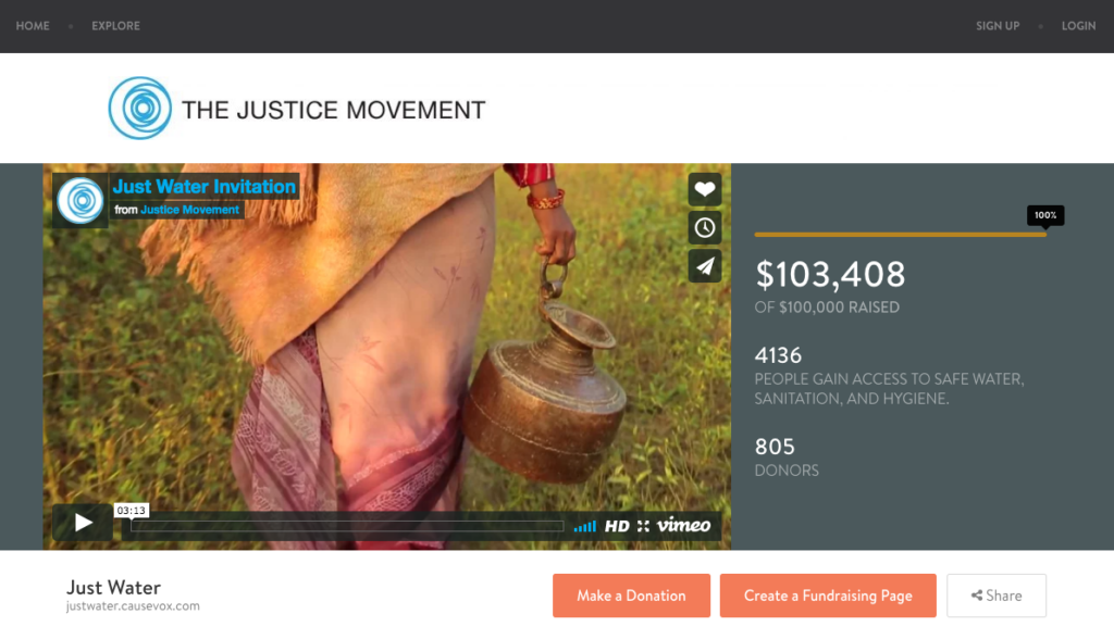
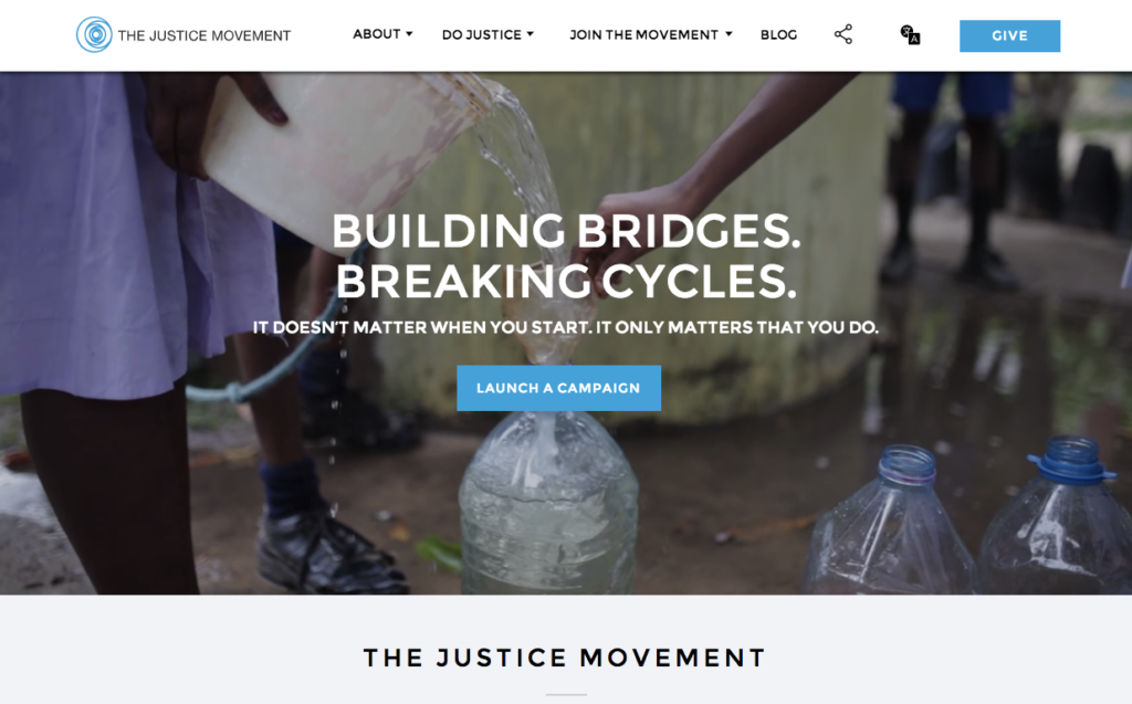
The Justice Movement raised more than $100,000 on their campaign, which was in thanks part to their featuring their campaign as the main CTA on their homepage while it was running.

The Justice Movement’s CTA “Launch a Campaign” draws the attention of anyone that lands on their website, and ultimately drives fundraiser signups for their campaign.

The accessibility of their campaign from their website is undoubtedly a factor in their campaign’s success. To direct people to your campaign site from your website, consider featuring your campaign as your main CTA on your homepage.
Ensuring your campaign is incorporated into your website is essential for informing your audience about your campaign and ultimately driving fundraiser signups and donations that help make your campaign successful.
Consider incorporating your campaign into your website using any or all of these methods to help your audience navigate to your campaign easily, and help you set your campaign up for success.


